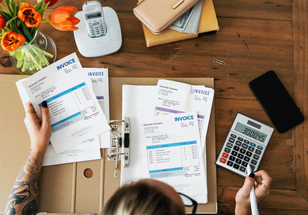
Invoice design may not seem like the top of your priorities list, but a well-designed invoice is one of the most important aspects of your business. Invoices tend to be the last time you contact a client, so a well-designed and intuitive format will help ensure your last impression is a great one. These ideas for invoice template PDFs can help you keep your invoice process running smoothly.
1. Sharp Shapes and Clean Colors
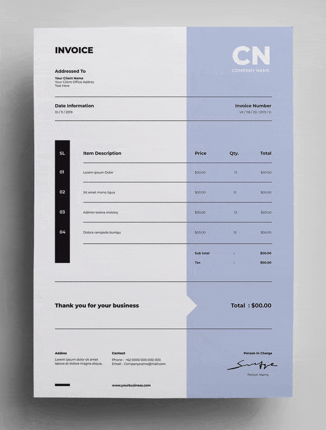
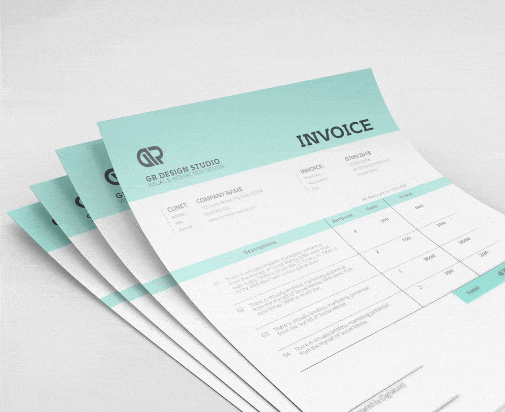
Product designer Aaron Dickey likes to keep invoices simple and professional. The goal is to simplify your overall page layout and make a pale, muted color block to help separate different sections. This will draw attention to your title, your final thank you note, and the details of the numbers.
It’s important to know what portions of the design should be emphasized, and then to build your design around that emphasis.
2. Use a Stamp of Approval
One elegant idea is to use an approval stamp graphic. Consider making your entire invoice with sharp and bold lines, using black-and-white formatting rather than color blocking. A colored stamp can break up that monotony and add a personal touch. It’s a small addition that draws the eye and encourages professionalism.
3. Use Bold, Friendly Lettering
Do you have a brand based around boldness and friendliness? If this is the case, your invoice design can incorporate some of your confidence and friendly demeanor. Start your invoice off with a confident greeting and then streamline the process of going through the document, ending with a thank you. You can structure your invoice like a conversation.
This kind of layout won’t work for every business, but you’ll have a good time playing with font weights, color, and scale to create the ideal attention.
4. Be Detailed, Classy, and Sophisticated
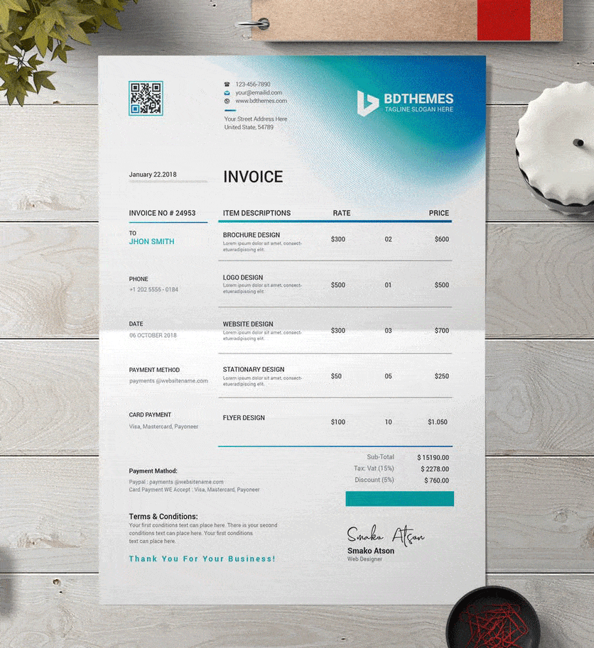
Cameron McEfee has created a design that holds a great deal of information, but still manages to be classy and sophisticated. Invoices don’t have to be minimalist to be effective. As long as you streamline your design, you should be able to add a great deal of detail.
Cameron’s design has contact information, billing addresses, a logo, and an invoice information table that holds all the relevant details of the work. The very bottom even includes a small calendar along with short terms and conditions. Blend function and form by integrating detailed information in a streamlined manner.
5. Use Clever Origami Packaging
Do you have a creative, out-of-the-box brand? If you’re thinking outside the box, you might want to translate that to your invoices. Consider folding your invoice in a unique way that leaves a lasting impression.
The way you package your material has a big impact on how customers see you. A beautifully-designed invoice won’t have as big an impact if it’s in a cheap envelope. Pay attention to your packaging and make the decisions that best suit your brand.
6. Try Minimalism
The page doesn’t have to be full from top-to-bottom with excessive type, graphics, and watermarks. Consider stripping your design and letting some white space into the invoice.
Designer Gaby Bonilla-Escala creates invoices that use wide margins, small type, and only the bare essentials in details. The result is an invoice that’s clean and sophisticated, easily getting to the point. It’s also easy to update, since it doesn’t adhere to any particular graphic design trends.
7. Line Your Paper
If your brand is based around creativity and design, consider how you might incorporate that into your invoice. One fun idea is to line your paper like a notebook. You can put your company information in the header at the top, then populate the lines with the important information.
This fun type of design will help keep your invoice memorable while also ensuring that it looks organized, neat, and to-the-point.
8. Use a Center Alignment
With the majority of invoices, the type is aligned to the left, with just a few elements aligned to the right. However, you may be able to create a more sophisticated and balanced design by using a center alignment.
Ari Krzyzek has created an invoice that uses center alignment with intentional coloring to highlight the important information. By using a matching patterned envelope and delicate border, the invoice balances function and sophistication.
9. Make Color an Adventure
If you decide to do this for your design, you’re certain to have a memorable invoice. Adventures in color are best done by designs with bold branding and a confident message. Consider sending your invoice on colored paper rather than white.
You should keep the other elements of the design simple: black ink that streamlines the reader through the invoice details. What really catches the eye will be the stunning background color. Bolder brands can use more saturated colors, while a lighter color will give a more sophisticated air.
10. Alternatively, Make Coloring Simple
If you don’t want to make your invoice reflect the colors of the rainbow, consider using an off-white or other neutral-toned paper color. This helps keep your design sophisticated and elegant while making it clear you’ve put thought into your invoice’s layout.
11. Make a Small Color Palette
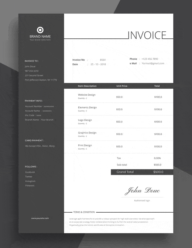
While we’re discussing color, consider different color palettes. An invoice doesn’t need a complicated palette. Consider a white, off-white, or neutral tone for the majority of the page. You can use a paler color for color blocking, and use a dark font color to complete the aesthetic. Color palettes should be selected with colors that work together. Consider a pale blue background with navy blue font.
If you’re trying to choose colors that work, consider using these 10 color tips that designers have put together.
12. Use Bold Lines
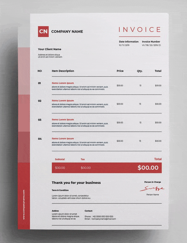
Most invoices need to use lines to help divide information and make the navigation easier. Some designs try to minimize or hide the lines by making them thin, faint, or entirely invisible. But you might want to consider making lines a bold focal point instead.
A bold border and bold invoice table will draw the eye while keeping your details neat and properly separated.
13. Use Graphics That Match Your Brand
Is your branding design built around colorful and funky graphics? Maybe you want to bring those elements into your invoice. Consider running colorful graphics along the margins of the invoice, where there’s no information to disrupt.
Heavy graphic work won’t fit every brand, but it’s good to note that invoices can reflect as much business branding as you want.
14. Try a Vintage Look
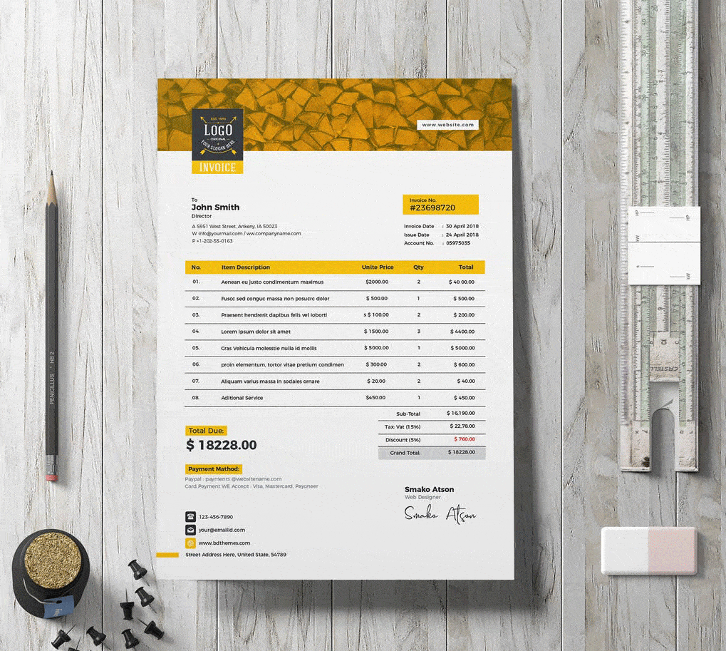
Vintage designs can help bring charm and elegance into your branding. Add some texture to the paper, along with warm tones. Just be sure you don’t overuse texture, as this can make your invoice look messy and busy.
Final Thoughts
The best invoice for your brand should reflect the aesthetic and confidence you’re trying to show. Make sure your customer remembers you in the future, while giving them an invoice that’s sophisticated and easy to navigate. And one helpful way to manage and edit your invoices, is to convert your invoices to PDFs using software. From there, it’s easy to organize and edit your invoice PDFs, while keeping all of your invoice templates in one place.
By Katherine M.


